Starbucks Coffee Company
Starbucks (произносится «Ста́рбакс») — американская компания по продаже кофе и одноимённая сеть кофеен. Управляющая компания — Starbucks Corporation. Starbucks является самой крупной кофейной компанией в мире, с сетью кофеен более 19 тыс. в 60 странах, в том числе 12 781 в США, 1241 в Канаде, 1062 в Японии, 976 в Великобритании (на март 2012 года) и 60 в России (на октябрь 2012 года). Starbucks продает эспрессо и напитки на основе него, другие горячие и холодные напитки, кофейные зёрна, чаи, горячие и холодные сэндвичи, пирожные, закуски и такие предметы, как кофеварки, кружки и стаканы. Штаб-квартира компании — в Сиэтле, штат Вашингтон, США. http://www.starbucks.com/
|
The Starbucks brand is one of the most recognized and admired in the
world. We believe our people and our products form the foundation
for our marketing strategy. The uncompromising quality of our products
and our focus on making a genuine, personal connection with our customers
have enabled us to create uplifting experiences that currently define and
differentiate us. And this has enabled us to inspire moments of connection
that create a brighter outlook for ourselves and our world. That is the
brand promise of Starbucks and the heritage entrusted to those who
market the brand. |
|
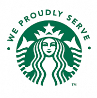
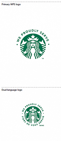
The primary WPS logo is composed of the Siren symbol and the phrase “We Proudly Serve.” The WPS wordmark is composed of the phrase “We Proudly Serve” locked up with the Starbucks wordmark. It always appears vertically reading upward, and should have a TM symbol. |

|
Consistent adherence to the color guidelines
will help build visibility and recognition of your
association with the brand.
Full-Color Logo
In the preferred use of the primary WPS logo,
the logo is Starbucks Green and white and is
placed on a white/light-color background.
Full-Color Reverse Logo
Use when background color or imagery adversely
affects the legibility of the wording. Note that
background color or imagery cannot appear
through the WPS logo nor can the logo be altered
in any way including, without limitation, to make it
fit any theme, ambiance or external environment.
The WPS logo can only be used as shown here.
One-Color Black Logo/One-Color Reverse Logo
Use is limited to one-color or two-color printing
where Starbucks Green is not available. |

|
Color Specifications
Print the primary WPS logo in its three correct colors:
Starbucks Green, black and white. (For Starbucks
Green, use Pantone® 3425 C. Do not use any
other green.) Print on uncoated stock, matching
Pantone® 3425 C ink to coated hue. No other
colors may be substituted. The Starbucks logo
on any other material must visually match
Pantone® 3425 C. If you are unable to print in color,
or if you are unsure that you can visually match to
Starbucks Green, you must print in two-color black
and white, or black only on a white background.
No other colors may be substituted.
Colors shown in this guide have not been evaluated by
PANTONE, Inc., and may not match the PANTONE
Color Standards. PANTONE is a registered trademark
of PANTONE, Inc. |

|
Full-Color Logo
Use the full-color logo when the background
color value is between 0% and 60% after
conversion to grayscale.
Full-Color Reverse Logo
Use the full-color reverse logo when the
background color value is between 80%
and 100% after conversion to grayscale.
One-Color Black Logo
Use the one-color black logo when the
background color value is between 0%
and 80% after conversion to grayscale.
One-Color Reverse Logo
Use the one-color black Siren symbol with white
type when the background color value is between
60% and 80% (after conversion to a grayscale). |

|
Clear space frames the logo, separating it from
other elements such as headlines, text, imagery
and the outside edge of printed materials.
The clear space indicated is the minimum.
Whenever possible, allow more than this amount
of clear space.
Primary WPS Logo
Minimum clear space is at least 2X, where X
equals the distance from the side of the Siren
symbol to the widest part of the logo.
WPS Wordmark
Minimum clear space is equal to 150% of the
height of the “B” letterform.
How Small Can I Go?
In the primary WPS logo, the Siren symbol should
be no smaller than .35" (9mm) width, while the
word Starbucks in the WPS wordmark should be
no smaller than .5" (13mm) height.
Primary WPS Logo with the Operator's Logo
The primary WPS logo should be 1/3 of the
operator logo size for pieces 8.5"x11" and
under. The primary WPS logo should be ¼ of
the operator logo size for pieces larger than
8.5"x11". This helps reinforce the relationship
(e.g., it’s Joe’s Café first and Starbucks plays a
supporting role). |

|
We encourage you to become familiar with the
correct uses of the primary WPS logo and WPS
wordmark. The integrity of the logo must be
respected at all times. Don’t stretch, condense or
otherwise alter or manipulate it. Any modification
of the logo confuses its meaning and diminishes
its impact.
1. Do not re-create or retype the words.
2. Do not stretch or alter our logo in any way.
3. Do not change our logo color.
4. Do not use graphic effects or outlines on
our logo.
Do not emboss the logo out of
a color background.
5. Do not place our logo in a shape.
6. Do not overlap other graphics or text
or photography.
7. Do not screen the logo. It should always
print at 100% ink density.
8. Do not reverse logo out of a color.
9. Do not add a ring around the siren.
10. Do not pair the primary WPS logo with the
WPS wordmark.
11. Do not angle the WPS wordmark. Always
use it vertically reading upward.
12. Do not rearrange the type, or change the
size of “We Proudly Serve” in proportion to
the Starbucks wordmark. |
|
|
|


