TAO
From an ancient Chinese philosophy to a global technology innovator. That, it seems, is the way of the Tao.
Pronounced ‘Dow’ to rhyme with ‘Wow!’, the name suits our business in many ways. As a company committed to open technology, a spirit of co-operation and partnership, and a simplified approach to multimedia creation, its meaning as ‘the way nature intended’ sums up our entire business philosophy.
Said to date from the 6th century BC, the Tao is a concept well suited to the 21st century AD. And it’s a name that serves us well as we imagine tomorrow…
Tao is a company that has had a global impact, and this makes a strong brand identity particularly crucial to the success of our organisation. It is imperative that wherever in the world we make our presence felt, there must be one coherent Tao image,
and that can only be achieved through consistent visual presentation.
This easy-to-use guide ensures we are all working towards this goal in order to build a strong and clear brand image. It is designed as a practical tool to govern all uses and applications of the Tao identity.
In everything we do,we all have a part to play in developing our unique positioning and taking the Tao brand from strength to strength.

|
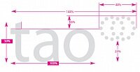
The logo is the most important part of the Tao brand identity. It is formed by combining the double ring
symbol with the Tao name style.This name style has been created to be highly legible and to reflect a modern,
high-tech organisation.
Visual consistency is paramount, therefore the logo must not be adjusted, redrawn or modified in any way.
The logo should always be implemented from approved sources. Digital logo artwork on disc and conventional logo
artwork for photographic copying or scanning are available. |
|
Proportional logo construction (%) |
|
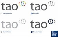
On this page you will see different colour variations of the Tao logo on a light tone background.
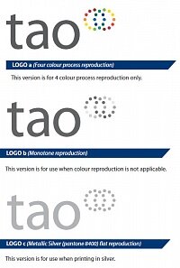
a) Full Colour version This is the preferred colour application, to be used whenever possible. It must not be reproduced less than 5mm measured across the width. It should only be reproduced from digital
artwork supplied on disc, or from high quality transparency if digital artwork is unsuitable.
b) One colour version This version should be used when no colour reproduction is applicable.This might
include black and white press advertisements or fax cover sheets.
c) Metallic Silver version (Pantone 8400) This version should be used when printing in silver.
d) Two Colour version This version is to be used only when it is impractical to use full colour due to budget or print restrictions.
|
|
On this page you will see different colour variations of the Tao logo on a dark tone background.
a) Full colour version This is the preferred colour application, to be used whenever possible.
It must not be reproduced less than 5mm measured across the width. It should only be reproduced from digital artwork supplied on disc, or from high quality transparency if digital artwork is unsuitable.
b) One colour w/o version This version should only be used when full colour reproduction is not applicable.
|

|
Preferred Minimum Size Tao Logo (viewed 100%) |
|
Intermediate Sizes Using the files provided, intermediate sizes of the logo may be produced by altering the resolution of the bitmapped image.
The proportions of these must not vary in relation to the originals. |

|
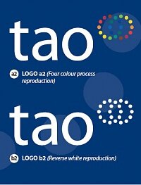
This version is for 4 colour process reproduction only.
When the logo appears on a solid blue background, it is necessary to include a tint blue element behind the double ring symbol. |

|
This version is for use when full colour reproduction is not applicable. |
|
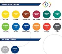
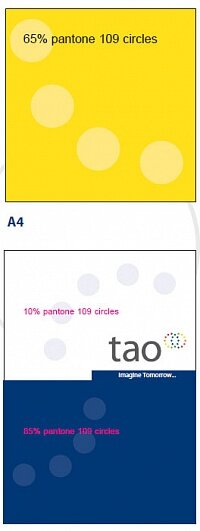
Colour forms an important and integral part of the Tao brand identity.The logo includes both primary brand colours
and secondary colours as shown here.
It is possible to use tints of the corporate colours to enhance a design layout where appropriate, particularly
on stationery.
Colours are defined by the Pantone Matching System (PMS).When reproducing the corporate colours in four colour
process, use the correct percentage mixes specified to achieve an acceptable match.
Due to variations between materials, inks etc., colours should be matched visually.Tear–off colour swatch sheets are
provided for this purpose. |
|
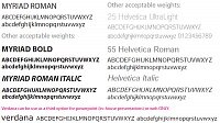
The Tao principal corporate typeface (housestyle) is Myriad Roman.
The housestyle should be used for all stationery items, signage, corporate newsletters and technical data.
The secondary typeface, Helvetica,may be used on similar items to the housestyle, and is to be used to add
emphasis, to bring out text as part of the design, and whenever an alternative typeface is required.
In both cases, a number of weights are acceptable as shown here.
A corporate title heading style has also been developed.This should be applied to all stationery, corporate
exhibitions and selected promotional items where appropriate.
All punctuation marks are followed by one letter space. Full points are omitted after exclamation and question marks.
Where quotation marks are essential, use single quotes only. |
|
Corporate title heading style
When using the corporate title heading style, two words should be used if possible.The first word is in Myriad Roman Bold.The second word is in Helvetica Ultralight.There is no word spacing.
|

|
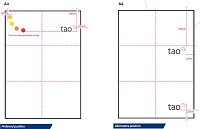
When using the Tao logo, the space immediately surrounding the logo should remain clear.
For the majority of logo applications, a clear margin on all four sides equal to one of the logo rings should remain free from all typography, graphics devices and edges of printed items or signs.
When possible, the logo should appear in the top right corner of the printed material. However, there are alternative positions which may also be used.
Layouts should give a spacious appearance around the logo whenever possible, and no borders, keylines, graphics,
patterns or illustrations should encroach on the logo in any way.
|
|
THE LOGOTYPE
The Tao logo is made up of the namestyle combined with the double ring symbol. It is important that the two
elements are positioned correctly in relation to one another.The double ring symbol always appears to the upper
right of the namestyle.
There is also a corporate strapline which may be used in some circumstances.When used, it must appear in
the specified colour, and it must sit directly beneath the logo. |

|
This should only appear as Myriad Roman in PMS 425 CV black or white. If using silver (p.8440) for the logo, the strapline should also be p.8440 silver |
|
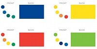
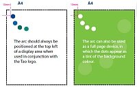
The Tao branding device is available to enhance and reinforce the identity.
It should be applied to appropriate corporate print material such as stationery items, corporate folders, signage,
newsletters and selected publicity material.
All materials must be kept as white on the front, with a solid colour on the back in accordance with the examples shown.
Preferred colours
IMPORTANT: When used on the front of an item, the branding device colours will change
according to the colour on the reverse as indicated. |
|
All materials must be kept as white on the front, with a solid colour on the back in accordance with the examples shown. |
|
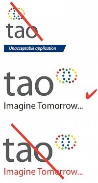
It is very important that the Tao logo should be used correctly at all times.
The temptation to alter the appearance of the logo in any shape or form to comply with the given design or print
requirements must be strictly resisted.
Illustrated here are just some unacceptable applications of the Tao logo. |
|
This is a range of Tao artwork logos suitable for making photographic copies or scanning for reproduction purposes where digital artwork is not available. |

|
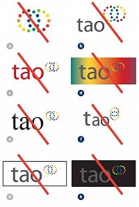
It is very important that the Tao logo should be used correctly at all times.
The temptation to alter the appearance of the logo in any shape or form to comply with the given design or print
requirements must be strictly resisted.
Illustrated here are just some unacceptable applications of the Tao logo. Never delete the namestyle from the logo.
a
Never change the proportional size of the namestyle and double ring symbol or delete the colours.
b
Never change any of the logo colours
c
Never set the Tao namestyle in any other
e
Never add a keyline border around the logo
g
Never apply the Tao logo to a dark background without using white type and a white keyline on the rings.
|
|
This is a range of Tao artwork logos suitable for making photographic copies or scanning for reproduction purposes where digital artwork is not available. |
|
|
|


