United Way
Founded upon a unique heritage of voluntarism and community building, United Way has served generations of Americans from all walks of life, providing both fund-raising and organizational resources to local charitable agencies.
Today, United Way is the nation's leading community impact organization,investing in and activating the resources that make the greatest possible impact in communities across America. We bring communities together to focus on their most important needs—building partnerships, forging consensus and leveraging resources in order to make a sustainable change in conditions.
We have a significant opportunity to build upon our traditional strengths, as well as to signal our organization’s movement owards a more meaningful and powerful mission—measurable community impact. Now is the time to declare what we stand for, what we value and what we are determined to achieve.
This is the foundation of our brand promise. We fulfill our brand promise to all of our stakeholders by serving our communities with diligence and integrity.
Vision
The vision we embrace is that United Way will build a stronger America by mobilizing our communities to improve people’s lives.
Mission
Our mission is to improve lives by mobilizing the caring power of communities.
Positioning
We recognize that a change in the approach to community building is necessary to improve conditions in the communities we serve.
United Way is determined that it can best fulfill its mission by shifting its role from fundraiser to leading community impact organization.
United Way Brand Identity Guidelines Version 1.0 © United Way of America 2004

|
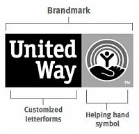
Brandmark
The most fundamental visual element of a brand identity is its brandmark. The new United Way brandmark signals a change for a new approach to the future while preserving the heritage of our past.
The evolution of our brandmark is most dramatic in its new configuration. The symbol is now joined together with the United Way name in a permanent, bold alliance. Its holding device is a simple rectangular shape that is unifying and inviolable.
The original components of our traditional brandmark–the rainbow of hope, the hand of support and the person as a symbol of humanity–have been maintained because they are still effective in communicating important United Way brand characteristics - caring, inspiring, trustworthy and approachable.
The changes to these key elements are intended to express new brand characteristics - innovative, dynamic and results oriented - characteristics that we need to help us achieve our community impact mission.
|
|
Brandmark:
- Customized letterforms
- Helping hand symbol
|
|
Full-color
The full-color version of the United Way brandmark is the primary brandmark of the identity system.
It is strongly recommended that this version be used in branded applications whenever possible.
Pantone, CMYK and RGB reproduction files of the full-color brandmark are available for specific application requirements. See the artwork finder on page 2.23 for complete specifications and files.
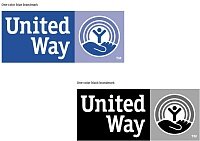
One-color
When reproduction constraints prevent the use of the primary full-color United Way brandmark, use one of the alternative one-color versions.
See the artwork finder on page 2.23 for complete specifications and files.
One-color blue brandmark
The one-color blue brandmark is to be used when United Way Blue is the only available
color selection. See the United Way color palette on page 3.1 for complete specifications.
One-color black brandmark
The one-color black brandmark is to be used when black is the only available color selection.
|

|
Background control
Background colors and graphics can easily overpower or compete with brandmarks.
A white outline has been built into the artwork to maintain separation between the United Way brandmark and the backgrounds where it will appear. This outline will not appear when the brandmark is staged on a white background. |
|
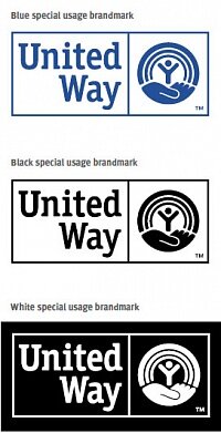
Special usage
The special usage United Way brandmarks are used when printing on colored surfaces, or screening of inks is not possible. This may occur when reproducing on plastic, glass, metal, fabric or other materials used for merchandise or signage. For printed materials, these brandmarks may only be used when the method of reproduction is faxing and photocopying or the surface of the paper is a color other than white. For example, this may occur when printing a black & white laser print on blue paper. When printing on white paper, the full-color or one-color brandmarks should be used at all times. See the artwork finder on page 2.23 for complete specifications and files. |
|
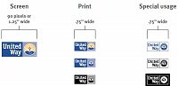
Minimum size
To ensure the integrity of the United Way brandmark, do not reduce its width to less than .75 inches for print or special usage, and 90 pixels or 1.25 inches for screen applications.
Other reproduction methods may require the minimum size to be greater than the sizes identified here. |
|
Unacceptable uses
The consistent and correct application of the United Way brandmark is essential.
Always follow the standards presented in these guidelines. The examples on this page illustrate some of the unacceptable uses of the United Way brandmark. |
|
Our new brandmark with tagline
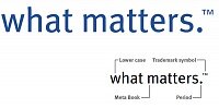
Our tagline is our primary marketing message. All communications and creative materials are rooted in the “what matters” concept.
The tagline should be used on all marketing communications, including print collateral, advertising and websites.
The tagline can be placed in two ways: with a fixed lock-up and flexible placement relative to the brandmark. The tagline always appears in all lower case, Meta Book Roman typeface, followed by a period and trademark symbol (TM).
See color, placement and size specifications on the following pages. Refer to the artwork finder on page 2.23 for complete specifications and files. |
|
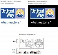
Tagline: Lockup treatment
When the tagline is locked up with the brandmark it appears in a fixed position underneath the brandmark. The size relationship and position have been determined for optimal communication of both the United Way brandmark and the tagline. Both brandmark and tagline must appear with a trademark symbol (TM). |
|
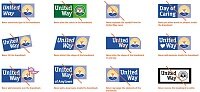
Tagline: Examples
The consistent and correct application of the United Way tagline is essential. The examples on this page illustrate some of its acceptable uses in both the flexible placement and the lockup treatments. |
|
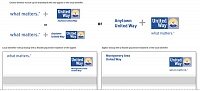
Localization: Examples
The consistent and correct application of the local identifier is essential. The examples on this page illustrate some of the acceptable uses of both the flexible placement and the lockup treatments of the local identifier. |
|
Localization & tagline together
When using both the local identifier and tagline on the same application, one of them must be treated as a lockup, while the other should follow the flexible placement treatment rules. |
|
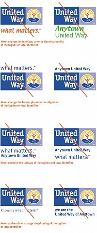
Tagline and localization: Unacceptable uses
The consistent and correct application of the tagline and the local identifier is essential.
Always follow the standards presented in these guidelines. The examples on this page illustrate some of the unacceptable uses of the United Way brandmark with the tagline and the local identifier. |
|
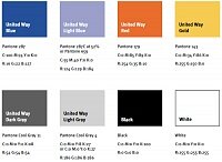
Color palette
It is important that United Way local member organizations maintain a consistent appearance of the brandmark and all visual communications across various media types and materials.
Using colors consistently in all communications will strengthen brand recognition, create impact and differentiate our programs.
The United Way color palette is comprised of colors used in the United Way brandmark.
In addition, two grays, black and white are included for added flexibility and one-color scenarios. On this page you will find specifications for reproducing the United Way colors in a variety of ways. |
|
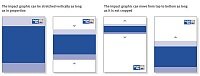
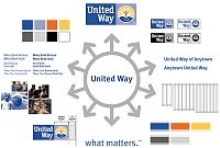
Impact graphic
The United Way impact graphic is a motif that helps create a distinct and consistent visual presence across our print and digital applications.
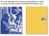
The impact graphic should appear once on all covers and website home pages, except when using full bleed images or full bleed United Way color. The impact graphic may also appear on interior pages although this is not a requirement.
The impact graphic extends from the left to the right edge of the application and can be stretched vertically as long as it remains in the same proportions. While the motif can extend to a full bleed, the minimum height is .625 inches. |
|
The only alternative to using the impact graphic on covers is using a full bleed image or full bleed United Way color |
|
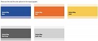
Impact graphic: Color
The colors used for the United Way impact graphic are limited to five colors from the United Way color palette. These colors, United Way Blue,United Way Red, United Way Gold, United Way Dark Gray and United Way Light Gray, have been selected for maximum impact. See the United Way color palette on page 3.1 for complete specifications.
The color proportions of 25%, 100%, and 50%,respectively must never change regardless of which of the five colors is used. |
|
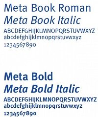
Typography
Three standardized typefaces have been chosen for the United Way brand identity. They are to be used in all printed and online communications.
Each of the fonts was selected for its visual compatibility with the United Way brandmark and for its ability to convey a personality that is consistent with our brand. Only use the weights and styles shown on this page.
Meta typeface
The primary typeface in the United Way brand identity system is Meta. Meta is a simple and clean typeface that conveys a humanistic and caring, yet professional tone. Use Meta in all headlines and subheads in printed and online applications. Meta may also be used for text.
|

|
Arial typeface
Arial is an acceptable substitute for Meta only when Meta is unavailable. Arial can also be used in text, PowerPoint™ presentations and for nongraphical text on websites. |
|
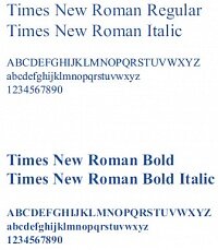
Times New Roman typeface
Times New Roman is a classic serif font that may be used in text, but should not be used in headlines or subheads. |

|
Imagery
A carefully managed approach to selecting photography will help position the United Way brand and create a distinctive and lasting impression. There are two general photographic categories for image selection, communities and portraits. Using images from these categories can help support text messages. It is important to select imagery that is dynamic, uplifting, caring and optimistic.
The main photographs in any communication should include people. This approach is in line with our evolution from a fundraiser to a community impact organization. It is important to show diversity in age, ethnic background, profession and personal interests.
Communities
United Way community photos show the interaction and contributions of people in their communities. Showing families in their homes, people in their business environments and friends having fun reinforces the benefits derived from United Way initiatives and programs.
Dramatic perspective and interesting cropping help give images an inspired feeling.
|

|
Portraits
United Way portraits capture the personality of the individual by featuring the person’s face when dramatically lit or tightly cropped. This enables the viewer to establish an intimate, engaging connection with the subject. The background should not overpower or compete with the portrait. |

|
Monotones can be made with any color in the United Way color palette |
|
Brandmark placement
Correct placement of the brandmark will help ensure the integrity of United Way communications. The brandmark should always be placed at a distance of a half of the symbol square from the right edge of any print or on-screen application. This applies to all versions of the brandmark, with or without the tagline and local identifier. While the brandmark will not necessarily align with the grid, its placement on the right and correctly measured spacing from the edge relative to the brandmark will ensure a consistent presentation. |
|
Brand identity: System overview
The brand identity elements reviewed in Section Two and Three inform our approach to application development. We can think of the elements of the identity system as our building blocks for all communication materials. By
following the guidelines on previous pages, we can meet the brand objectives that are defined by our positioning, mission and vision and still maintain the flexibility to develop uniquely creative and impactful designs. |
|
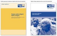
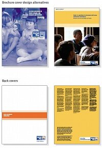
Brochure: Front and back covers
Brochures are effective communication vehicles used to convey information about our programs in a compelling and engaging way. |

|
Brochure: Full-color brochure cover
|

|
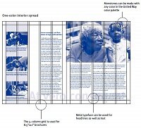
Brochure: Interior spreads design alternatives
Based on United Way grids, interior spreads afford enough flexibility to suit different styles of communications. |
|
One-color interior spread |

|
Newsletters
A newsletter can accommodate a large body of text and still convey the essence of the United Way brand. |

|
One-color newsletter |
|
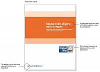
Report covers
Using report covers helps to create visually distinct and professional presentations. |
|
Full-color report |

|
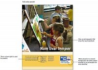
Posters: Posters are a popular way to communicate locally.
Poster design alternatives
|
|
Full-color poster |
|
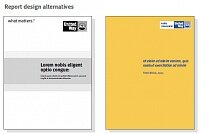
Print advertisements
When promoting the United Way on both a national and local level, you might want to use advertising. Because advertising is a very visible form of communication, it must adhere to the brand identity guidelines to ensure consistency of our brand image.
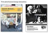
Print advertisement design alternatives
|
|
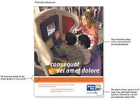
Print advertisement |
|
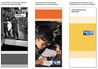
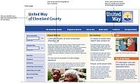
Website
The web page shown here brings to life our unique positioning and personality through use of the core brand identity elements. It also provides a visual benchmark for guiding the development of all United Way sites. |
|
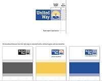
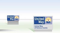
Exterior signage
Signage provides a means to consistently identify, locate, direct and inform across operating sites and offices around the country.
Shown here are two types of monument signs that might appear in front of a United Way building or office. Exterior signs do not need to use the white background control outline around the brandmark as long as it is placed on a light background. The trademark symbol does not need to appear on signage. |

|
Interior signage
Effective signage is an important opportunity to make a positive impression on internal and external audiences.
Shown here is a sign that might appear near or behind a reception desk. Interior signs use the white background control box around the brandmark as specified in these guidelines.
The trademark symbol does not need to appear on signage. |
|
|
|


