Cap Gemini Ernst & Young
Cap Gemini S.A. is a French multinational corporation headquartered in Paris, France.[2] It provides IT services and is one of the world's largest consulting, outsourcing and professional services companies with more than 130,000 employees in over 40 countries.[3][4][5] It was founded in 1967 by Serge Kampf, the current vice-chairman, in Grenoble, France. Paul Hermelin, the chairman and CEO of the Capgemini group has led the company since his appointment in December 2001. Capgemini's regional operations include North and South America, Northern Europe & Asia Pacific and Central & Southern Europe. Services are delivered through four disciplines; Consulting, Technology, Outsourcing and Local Professional Services. The latter is delivered through Sogeti, a wholly owned subsidiary.
|
Logotype
Our logotype is the foundation of our visual identity. It should be presented
in its proper form, dimensions and orientation on all our materials.
Alteration of the logotype or its components should never be undertaken
without prior approval from the Corporate Communications Department. |
|
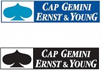
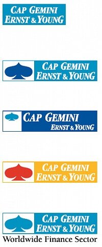
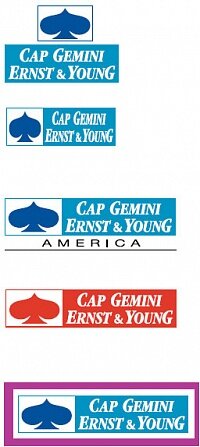
This is the correct form of the Cap Gemini Ernst & Young
logotype, in color and black and white. Be sure to use
only a digital or camera-ready version of the logotype.
The logo can appear on a white or light solid background,
or on a black or dark solid background. |
|
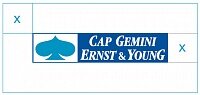
The Protection Zone
The protection zone is the area around the logotype that must be
free of any text or imagery. |
|
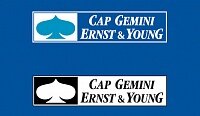
Logotype: DON’T |
|
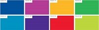
Color Palette
Color is as important to our brand as our logotype or typography. It is largely
the way our colors interact on a page (or a screen) that creates the unique
feel of our brand. As you will see, all of our colors have been selected to
complement one another and our logotype. |
|
Our Visual Identity
The building blocks of our brand—logotype, colors and typography—are
brought together in a coherent visual identity that is designed to convey our
most important brand attributes. It is very important for designers, communications
and marketing personnel to be familiar with the look and feel of
our visual identity system as it relates to materials under their supervision.
Our visual identity communicates our most essential brand attributes
(“talented, creative and entrepreneurial”) through style criteria that have
been developed to translate our brand message into visual terms. The corresponding
style criteria are “bold, unexpected and focused,” characteristics
which should apply to all materials produced by the Group. See Chapter 5
and the Identity Guidelines site for more information on these terms.
As you can see, the layouts and materials that conform to the visual identity
system combine bold use of color and unexpected imagery with a focused
approach to design.
Successful implementation of the visual identity system will result in materials
that reflect our brand’s unique characteristics. They will combine use of
the logotype, colors, a distinctive style of imagery, and repeated design elements
to communicate a clear and compelling brand personality.
The information presented here is only a small portion of what is contained
on the Identity Guidelines site. Please visit: www.cgey.com/guidelines for
more detailed guidance, additional ways to build the brand, and useful
templates for producing a variety of materials. |
|
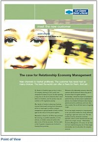
A4 Brochure Cover |

|
A clear understanding of the meaning of our brand means little if we lack
the tools to put it into practice. How do we create materials that “say”
Cap Gemini Ernst & Young? That reinforce our brand message and connect
to our customers? What kind of images and copy support the brand?
The answers to these questions are necessarily somewhat subjective. A
photograph that says “creativity” to one person may say something quite
different to another. Nevertheless, developing and using executional style
criteria is an essential step in communicating the brand effectively.
The examples offered below are neither exhaustive nor definitive. They are
meant to offer guidance in translating concepts like “talented,” “creative” and
“entrepreneurial” into a consistent style of prose and design. Using them as
inspiration for your own creative efforts will help you project a common
understanding of our brand to the outside world. |
|
Style Criteria
Every brand has many attributes—that is, descriptors of its corporate assets
and personality. But a smart brand will define its most essential
attributes and use these as the springboard for all its communication.
This will ensure that all content stays focused and consistent for all the
brand’s key audiences.
But even consistency of content is not enough. The brand’s “aesthetic”—its
design and copy style—plays a large role in projecting the brand’s unified
front.
In the chart presented here, we show how key attributes from the brand
vision can be translated into style criteria with direct applications in
writing copy and designing publications. Below, we show how these
criteria (bold, unexpected and focused) can be applied to materials
produced within the Group. |

|
Interpreting the Brand in Copy: Brochure
This opening page for an IT brochure is a good example of how overly
technical language can make our brand seem dull, predictable and irrelevant.
Since this copy introduces this brochure, it should also introduce the
reader to the key personality attributes of our brand: talented, creative and
entrepreneurial. The “do” version brings in these attributes through both
content and style. |
|
|
|


