Joomla!
Joomla! (произносится джу́мла) — система управления содержимым (CMS), написанная на языках PHP и JavaScript, использующая в качестве хранилища базы данных СУБД MySQL или другие индустриально-стандартные реляционные СУБД. Является свободным программным обеспечением, распространяемым под лицензией GNU GPL.
|
Using The Logo.About the mark.
The Joomla! logo consists of the logotype and the mark. The mark represents what Joomla! is about...a community coming together as one. The mark is made up of four “J’s” rotated and linked together that represent the community coming together as one. This logo has been developed to promote high visibility of the mark balanced with clear legibility of the name. The relationship (size, positioning, etc.) of these elements should never be altered in any way.
When possible, the logo should appear in it’s full color horizontal gel version.
When the gel version cannot be used, a solid color version is available.
Vertical Version.
While the horizontal logo is the preferred version, there is also a vertical version of the logo provided to give greater flexibility for all graphic communications.
It may only be reproduced in the logo palette colors listed in this manual.
For all color conversions including PANTONE coated, PANTONE uncoated, four-color process (CMYK), RGB, and web see page 31.
When the gel version cannot be used, a solid color version is available.
|
|
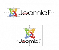
Area of Isolation. The Joomla! logo is a clean and strong mark and should be treated with respect in all usages. A minimum amount of white space around the logo is required. For the minimum amount of white space required, use the width of the “o” in Joomla! as the unit by which to measure white space on all sides of the logo. This area of isolation protects the logo from other imagery, graphics, and page trim. Only the Joomla! web site address or tagline may be placed closer to the logo. |
|
Size of the Joomla! Logo.
Depending on usage, the size of the logo will change. The logo should be sized for clear legibility with the minimum amount of white space around it. This will often be more visually appealing than a logo that is sized too large for the space available, making it cluttered and harder to read. Let good taste be your guide when sizing the Joomla! logo.
Minimum Size Requirements.
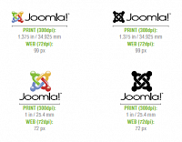
For ideal legibility, the horizontal version of the logo should be used in small space applications. The minimum width of this logo is 1.375 inch / 34.925 mm.
The minimum width of the vertical version is 1 inch / 25.4 mm.
|
|
Don’tsConsistent Presentation of the Joomla! Logo.
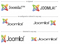
Presentation of our logo consistently is important and helps to promote recognition of the Joomla! brand. These examples and the examples on the following page help to avoid misuses of the logo.
Never combine the logo with any other text (other than the tagline) or logo. It must stand alone with at least it’s minimum amount of white space surrounding it.
|
|
Typography.
Helvetica.
Typography is critical when creating clear and consistent brand communications. These typefaces, when used regularly across all our printed graphic communications, will provide a clear and recognizable brand voice. The primary typeface chosen to communicate the Joomla! voice is Helvetica because of its easy readability and surplus of typefaces. This font should be used in all graphic communications.
Helvetica offers many weights available to you which offer a large amount of design flexibility for all graphic communications. From body copy to headlines, this typeface will cover all design needs.
Only under special circumstances and approval, can typefaces other than the ones listed in this manual be used.
Logo Colors.
Color is a strong and communicative element to any brand identity. The Joomla! logo is made up of an attractive and dynamic palette that will bring color and vibrance to all communication materials.
The harmonious blend of colors provide great flexibility in design while producing a consistent brand color scheme for all communications.
When used, the logo color palette will generate a strong brand unity and create visually stunning materials that reflect the brand name.
|
|
|
|