TYPO3
TYPO3
TYPO3 Web Content Management Framework. Одним из наиболее мощных представителей CMS с открытым исходным кодом является система TYPO3. Эта система достигла наиболее высокого профессионального уровня, очень универсальна и легко изменяема в зависимости от применения. Разработка TYPO3 начата 1998 году датским программистом Каспером Скархей. Сейчас TYPO3 распространена во всем мире. TYPO3 интенсивно развивается: ежегодно выпускаются 2 новые версии системы, активно работает TYPO3 Ассоциация. Как и многие другие системы с открытым исходным кодом, TYPO3 распространяется под бесплатной лицензией GPL и свободно доступна через интернет.
|
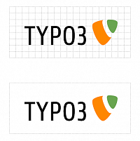
Logo Construction and Save Area. The new TYPO3 Logo has two elements: the name itself and the logo shape. Size and Position of the elements is based on the grid shown on the left. Each grid unit has a side length of one third of the height of a standard letter of the font typeface.
The so-called save area is the area surrounding the logo, that protects it from other graphic elements and helps it to remain easily recongnizable. No other graphic element my enter this area in any of your applications of the logo!
|

|
Logo Color.To achieve a unique and recognizable impression the logo colors were defined. These colours need to be used without exception.
Orange:
PANTONE Orange 021C
R: 255 / G: 135 / B: 0
#FF8700
Green:
PANTONE 354C
R: 105 / G: 165 / B: 80
#69A550
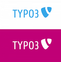
The text is black on light backgrounds and white on dark backgrounds. The black on white (positive) variation is the standard and should be used whenever possible.
|

|
Logo Greyscale.Attention: applications in greyscale on dark or light backgrounds use different grey values respectively.
POSITIVE:
Light:
55% Black
R: 140 / G: 140 / B: 140
#8C8C8C
Dark:
80% Black
R: 81 / G: 81 / B: 81
#515151
NEGATIVE:
Light:
35% Black
R: 185 / G: 185 / B: 185
#B9B9B9
Dark:
55% Black
R: 140 / G: 140 / B: 140
#8C8C8C
Please use the color variation (standard) on
multicolour backgrounds or the following
monochrome version.
|
|
Logo monochrome. Monochrome applications can in some extraordinary cases be used, for example when the logo is used within the boundaries of another CI demanding a different colour to be used. The negative monochrome version is to be preferred in this case.
Attention: in these special cases no other colour belonging to the TYPO3 CI is to be used. It is also not permitted to use more than one colour in the logo and typeface combined.
|
|
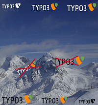
Logo on Pictures.When embedded in pictures, the logo should be placed at the top or bottom of the image. The logo can only be used once per image. The size is flexible, but should not exceed 5% of the image size. In very small applications the black or white varition of the logo is acceptable.
Attention: the logo is not to be placed in any other orientation but horizontally or next to an object.
|
|
|
|
|


