GARMIN
GARMIN
Garmin Ltd. — производитель GPS-навигационной техники. Навигаторы Garmin предназначены для различных сфер применения, включая автомобильное, авиационное, морское, туристическое и спортивное оборудование, а также оборудование для беспроводных приложений.

|
Elements:
Our logo consists of three elements:
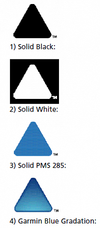
1 - the pointer
2 - the GARMIN logotype
3 - the trademark symbol
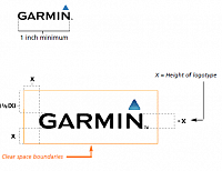
Size:
The size of our logo is a critical factor in communicating our brand properly and consistently. Just
as a logo that is too small diminishes the impact, a logo that is too big, can imply a lack of quality
and refinement, as well as diminishing its impact.
Our logo should never be used so small that it is illegible.
(minimum size for our logo is 1 inch horizontal)
Our logo should never be used so large that it overpowers
surrounding elements and the overall communication piece.
|
|
Clear Space:
A clear space equal to the height of the Garmin logotype is the minimum
area that must remain clear on the sides and bottom of the logo. A clear
space equal to one half the height of the logotype is the minimum area
that must remain clear above the logo. This neutral zone assures proper
emphasis to our logo, and assists in its easy identification.
|

|
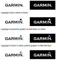
Logo colors: There are three approved colors for the Garmin logo: 1 - Garmin blue (pms 285) 2 - black 3 - white PMS 285 CMYK equivalent Cyan=91% Magenta=43% Yellow = 0% Black - 0% PMS 285 RGB equivalent Red=0 Green=119 Blue=212 Production of the Garmin logo or pointer graphic in any colors aside from these three approved colors must be approved by Garmin's Marketing Communications department. |
|
Logo Background:
In most instances, the Garmin logo should appear as black with solid PMS 285 triangle on a light
background, or reversed white type and solid PMS 285 triangle on a dark background.
It is acceptable to put a Garmin logo on a photographic background as long as there is suitable
contrast for the logotype and pointer graphic to stand out and be readily identifiable. Again, the
black logo should be used over a light photographic background, and the reverse white logo
should be used over a dark photographic background.
Following are examples of acceptable and unacceptable applications.
(as you can see, the white logotype with blue triangle should only be used on a very dark (black) background.
Any other use of this logo must be approved by Garmin’s marketing communications department)
|
|
Correct Usage: Consistent presentation of our corporate I.D. is critical to maintaining a quality image in the marketplace. Our signature mark, which consists of the Garmin logotype and the shaded blue pointer, has been precisely crafted to enhance our brand presentation. As such, it’s usage will be restricted, and only authorized by specific request of Garmin’s Marketing Communications department. |
|
|
|
|


