Sony VAIO
Sony VAIO — одна из торговых марок компании Sony, принадлежащая их персональным компьютерам. Слово VAIO изначально являлось акронимом от «Video Audio Integrated Operation», но подобная трактовка названия была изменена на «Visual Audio Intelligence Organizer» в 2008 году в честь 10-летия торговой марки. Несмотря на то, что впервые компания Sony начала выпускать в 1980 году персональные компьютеры для японского рынка, она свернула производство в этом направлении на полтора десятка лет и вернулась в свет уже под брендом VAIO в 1996 году с настольными компьютерами (десктопами) с индексом PCV. В России ноутбуки Sony впервые появились в 1996 году и неофициально привозились преимущественно из Германии. Официальные поставки в РФ начались спустя девять лет — в 2005 году, хотя к тому времени продукция марки Sony VAIO получила довольно широкое распространение. Немалую роль в этом сыграл тот факт, что в течение 2-5 лет до начала официальных поставок VAIO в РФ вышеупомянутые ноутбуки повсеместно использовались (и используются) в Государственной Думе РФ и, соответственно, крышки с крупным логотипом регулярно мелькали в СМИ. Некоторые эксперты считают данный факт одним из самых крупных продакт-плейсментов в истории.
|
Sony Logo Standards
Sony is one of the world’s most successful brand names. To millions of
consumers, the famous Sony logo is synonymous with innovative, reliable,
high-quality products. It is vital, therefore, that this reputation for
excellence is supported by a strong and consistent corporate identity.
This can only be achieved by adherence to the guidelines established by
Sony.
Use of the Sony Logo:
• ALWAYS use ‘original’ artwork of the Sony logo. Poor quality
reproductions of the logo tarnish the company’s image.
• ALWAYS display the Sony logo on its own. The logo should NEVER be
combined with other figures, words, trademarks or symbols.
• NEVER use the Sony logo in a headline or in copy text.
|
|
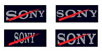
SONY Logo Formats.
• NEVER alter the Sony logo in any way, or add extra elements to it.
• NEVER distort the Sony logo, horizontally or vertically.
• In the main, the Sony logo appears in 50% black on VAIO black on the
front of sales literature.
• ALWAYS display the Sony logo horizontally, and never vertically,
diagonally, in an arc or otherwise.
|
|
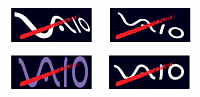
VAIO Logo Formats.
• NEVER alter the VAIO logo in any way, or add extra elements to it.
• NEVER distort the VAIO logo, horizontally or vertically.
• ALWAYS display the VAIO logo horizontally, and never vertically,
diagonally, in an arc or otherwise.
VAIO Logo Colours.
• In all below-the-line communications material the VAIO logo can be
either white, a minimum of 25% black or a maximum of 50% black on
VAIO black.
• It is encouraged to use spot varnishes on the VAIO logo to enhance the
quality and appeal of the piece.
|

|
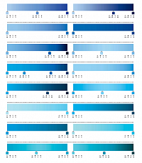
You Make It A Sony Cluster Colours.
• Clusters used on VAIO advertising should always be blue. • Colours must be chosen from the palette below. • When making their selection, designers should choose colours which complement the colour and overall mood of any photography used. • The range below will provide ample choice.
|
|
Example Gradients.
So as to imply depth and movement, the individual shapes of the clusters
should be filled using gradients. These gradients must be constructed
using two or more colours from the same horizontal row of the colour
palette.
As illustrated in the examples below, the gradients should use sensitive
variations of colour and tone. Don’t use colours from opposite ends of the
palette and don’t use gradients which swing wildly from dark to light tones.
|
|
|
|


